


iOS Control Center - Panel
3.510.00 Reviews
App Specs
- Version
- 1.0.12
- Updated On
- License
- Free
- Downloads
- 1,000,000+
- Developer
- Byte Bloom
- Categories
- Personalization
- Platform
- Android
Screenshots
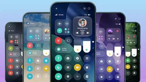
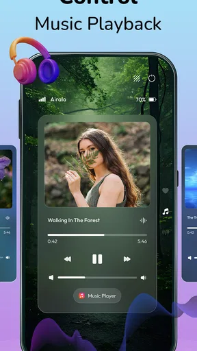
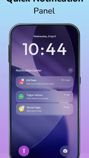
 Analysis by AppCompare
The appeal of iOS Control Center - Panel is easy to understand: it brings an iPhone-inspired quick-access panel to an Android phone. That is a focused personalization idea, not a full replacement for Android’s interface. I’d consider it if I wanted a different-looking way to reach everyday controls, but I’d judge it by one practical question: does the new panel make the actions I use often easier to reach than the one already built into my phone?
A familiar panel, with a different purpose
I’d frame this section around the app’s one clear idea: bringing an iOS-inspired quick-access panel to Android, rather than transforming the whole phone. That distinction helps set a fair expectation before trying it. The useful question is whether a familiar-looking surface makes routine controls feel more comfortable to reach.
What the iOS-style approach changes
Android already gives you quick settings through the system notification shade. This app’s point is to offer a panel modeled on the appearance and interaction style associated with iOS Control Center. For someone who likes that visual language, the attraction is less about gaining a new phone capability and more about changing the feel of a routine gesture.
That distinction matters. A personalization app can make a phone feel more familiar or more enjoyable without being essential. If you switch between Android and an iPhone, or simply prefer the iOS-inspired layout, a consistent-looking panel may make quick access feel more natural. If you are happy with Android’s built-in shade, the extra layer may not improve your day.
Byte Bloom makes this as a free Android app in the personalization category. It has a 3.5 average from around 1.9 thousand ratings, with over one million installs. I’d read that as a sign of broad curiosity about the idea, not proof that the panel will suit every Android setup. The app is rated for Everyone, and its current release is version 1.0.12.
Why this can be more than a cosmetic choice
A quick-access panel is something you reach for repeatedly, often without thinking. Changing its visual style can make your phone feel more personal, but the more useful test is whether the new arrangement helps you act with less hesitation. A panel that looks right to you may be more pleasant to use; a panel that feels unfamiliar or interrupts your usual habits can have the opposite effect.
I would approach it as an alternative front door to quick controls, rather than assuming it replaces every part of Android’s system interface. Keep your expectations centered on that one job. That makes it easier to decide whether the app earns a place on your phone, and it prevents the iPhone-inspired appearance from being mistaken for a wholesale conversion of Android into iOS.
Worth Reading Before You Choose

Baby Panda World Brings Quick Play to Modern Phones, but Its Game Library Feels Busy

ESPN’s Live Game View Makes Following Close Games Easier

QuizzLand Review: A Good Fit for Short Trivia Breaks, Not Every Player

Basketball Stars: Multiplayer Is Fast, but Can It Recover When Matches Go Wrong?

WEBTOON Turns Phone Updates Into a Better Reading Routine

Link to Windows Runs on Shared Habits, Not Social Feeds
What to check before building a habit
Because this is a panel you may reach for throughout the day, I’d decide in advance what “better” means for me. It might be that I enjoy the iOS-inspired look, or that I can reach the panel without interrupting what I’m doing. Keeping that goal specific makes the trial more useful than judging it only by whether the first impression is attractive.
How it fits into an ordinary day
I’d judge the panel by how it fits into real habits, not just by how it looks when opened for the first time. A quick comparison with Android’s native shade can reveal whether the new presentation genuinely helps or simply adds another route to remember. That everyday test matters most when the panel is meant to be used without much thought.
Try it against your existing habit
When you install a panel-style app, the first question is not whether it looks polished in isolation. It is whether reaching it feels convenient alongside the way you already use your phone. I’d test the panel during a few familiar moments: when I want a quick control, when I’m switching between apps, and when I’m holding the phone one-handed. Those situations reveal friction that a first glance at the design cannot.
Give yourself a short trial before deciding. Notice whether you instinctively open Android’s normal shade instead, whether the new gesture or access point is easy to remember, and whether the panel gets in the way of another action you use often. If you keep reaching for the old control surface, that is useful feedback; it may mean the app does not fit your muscle memory, not that you have failed to set it up correctly.
One practical tip is to test it in the same conditions where you expect to use it most. If you usually check quick controls while walking, holding a bag, or using your phone one-handed, evaluate it that way rather than sitting at a desk. A design that seems clear when you have both hands free might be less convenient during a rushed moment.
A realistic use case
Imagine you are settling into a café, putting your phone down, and making a few routine adjustments before returning to a message. The value of a quick panel is that these small actions stay close at hand instead of requiring a trip through settings. If you prefer the iOS-style presentation, this app may make that brief interaction feel more like the interface you enjoy.
The trade-off is that Android’s own quick settings are already designed for this sort of task. If the built-in shade is fast and familiar, adding another way to reach controls can create a choice rather than remove one. I’d keep the app only if its particular presentation is a benefit I notice repeatedly, not just because the first screen looks different.
This is also where expectations about compatibility matter. Android phones vary in their interface and their existing shortcuts. A panel that feels like a natural addition on one device may feel redundant on another. Try it on your own handset before building a habit around it, and avoid assuming that an iOS-inspired appearance means every interaction will behave exactly as it does on an iPhone.
Small workflow choices that make the test fair
For a useful comparison, don’t change several parts of your phone’s setup at once. Try the panel on its own, then compare it with your usual Android controls over the same kind of day. That way, you can tell whether the panel itself is helping, rather than attributing a better or worse experience to a separate theme or launcher change.
I’d also pay attention to accidental access. A quick panel should be easy to reach intentionally but not so easy to trigger while using another app that it becomes a nuisance. If you find yourself dismissing it when you did not mean to open it, the visual appeal may not outweigh that interruption. A few repeated accidental openings are more meaningful than a promising first impression.
Finally, ask whether the iOS styling is the reason you want it. If your goal is simply faster access to controls, compare it honestly with the built-in Android shade before adding another layer. If your goal is to make Android feel more like an interface you already enjoy, the same styling may be the point rather than a distraction.
One useful comparison to make
Try the same routine with the app and with the native shade: reach for a control, close the panel, and return to the task you were doing. The native option is the sensible benchmark because it is already part of your phone’s workflow. If the app wins only when you stop to admire its appearance, but loses when you are in a hurry, that tells you what kind of value it offers—and whether that value is enough for you.
Where the trade-off shows up
The main trade-off is between a style you may prefer and the convenience of staying with Android’s familiar controls. I’d also keep the free-to-try nature of the app in mind: its in-app purchases range from $16.99 to $21.99 per item, so it makes sense to decide whether the core panel suits you before considering a purchase. The next question is whether that balance fits your priorities.
Familiarity versus Android’s built-in controls
The clearest limitation is also the app’s defining choice: it gives you an iOS-inspired alternative, while Android already has a quick-settings system. If you value a consistent Android workflow, the extra panel could feel like an unnecessary detour. If you value the iOS look, that difference may be exactly why you install it. Neither preference is automatically better; the right choice depends on which interface you want to reach for every day.
I would not treat the app as a reason to abandon Android’s native controls. Think of the two as competing ways to handle a small, repeated task, and keep the one that feels more dependable on your device. If the app’s panel does not suit your habits, returning to the built-in option is a sensible outcome rather than a failed experiment.
Free to start, with paid items available
The app is free to download, but it also offers in-app purchases priced from $16.99 to $21.99 per item. That is worth knowing before you invest time in making it part of your routine. I’d first work out whether the basic idea—the iOS-style quick-access panel—actually improves your experience. Only then would I consider paying for anything offered inside the app.
That approach is especially useful for a personalization tool. A visual change can feel exciting on the first day and ordinary by the end of the week. Before spending, ask whether you still reach for the panel naturally after the novelty has faded. If you do not, a paid option is unlikely to fix the underlying mismatch between the app and your habits.
Device fit and everyday interruptions
Android is not one uniform interface. Different phones can already have their own shortcut styles, gestures, and visual treatments, so an additional iOS-inspired panel may feel more or less at home depending on what you use. The app supports Android 8.0 and later, which makes it relevant to a broad range of devices, but that does not guarantee the same day-to-day feel on each one.
Before relying on it, check how it behaves in the parts of your routine that matter: opening it when you intend to, getting back to what you were doing, and avoiding conflict with your existing habits. If it interrupts an action you perform often, that is a meaningful cost. A personalization feature should make the phone feel more comfortable, not require you to keep correcting it.
There is also a simple question of taste. If you are not drawn to iOS styling, the main reason to try this app disappears. Someone who wants a cleaner or more conventional Android experience will likely be better served by the controls already on the phone rather than by adding an interface with a different visual identity.
When the simpler option is better
If you already know where your Android controls are and can reach them without thinking, I would not add another panel just to make the phone look different. The native shade has the advantage of belonging to the system you already use. That makes it a better choice for anyone who values consistency over an iOS-inspired appearance, or who would rather spend no time adapting a familiar gesture.
Likewise, if what you want is an entire iPhone-like experience, this focused panel is unlikely to satisfy that broader expectation. Its appeal is the quick-access surface, not a promise that every screen or behavior on Android will change. I’d install it for the specific interface idea, not as a shortcut to changing the identity of the whole phone.
Who is likely to enjoy it?
I see the strongest appeal for Android users who enjoy customizing their interface and specifically like the iOS-inspired look. Someone content with the built-in quick settings may have little to gain, while anyone expecting a complete iPhone-like system should keep the app’s focused purpose in view. I’d choose based on which panel I actually want to reach for during an ordinary day.
A good fit for interface-minded Android users
I can see the strongest case for this app among people who actively customize their phones and enjoy the iOS look. It may also appeal to someone moving between Android and iOS devices who wants a familiar visual cue on both. For these users, the panel is not just decoration: it changes the feel of a frequent interaction, which can be a satisfying way to make an Android phone feel more personally theirs.
It is a weaker fit for someone who wants no extra setup, relies on the existing notification shade, or prefers a strictly Android-style interface. It may also disappoint a person expecting a complete iPhone experience. An iOS-inspired panel is a specific interface choice, not a promise that the rest of the operating system will behave like Apple’s software.
That makes the decision fairly straightforward: try it if the panel’s look is something you genuinely want to use, and skip it if you are only searching for a faster route to controls you already access comfortably. Its one-million-plus installs show that the idea has wide appeal, while its 3.5 average suggests that individual fit still matters more than the concept alone.
My recommendation
I’d recommend giving iOS Control Center - Panel a careful try if you enjoy personalizing Android and specifically want an iPhone-inspired quick-access experience. Start with ordinary use, compare it with your phone’s native shade, and keep it only if it feels natural after the novelty wears off. That is a better test than deciding from appearance alone.
If you prefer Android’s usual controls, there is no strong reason to add another panel just for the sake of changing things. If the iOS-style presentation makes a familiar task more pleasant for you, the app may be a worthwhile free experiment. Byte Bloom’s personalization app is at its best when its central idea matches your taste; otherwise, the built-in option is likely the simpler choice.
Pros
- Quick access to essential controls without leaving the current app.
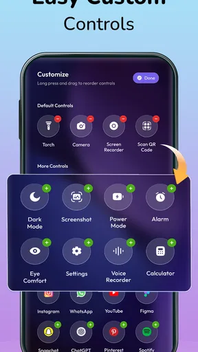
- Customizable shortcuts make frequently used tools easy to reach.
- Simple layout is easy for new users to navigate.
- Handy for adjusting brightness and volume on the go.
- Can help reduce time spent searching through Settings.
Cons
- Some controls may require an unlock or extra tap to use.
- Available shortcuts can vary by iOS version and device.
- Accidental swipes may open the panel during games or videos.
- Third-party apps may not be able to add every desired control.
- The panel can feel crowded when many controls are enabled.
FAQs for iOS Control Center - Panel
What does iOS Control Center - Panel do?
iOS Control Center - Panel is designed to give an Android device a control panel inspired by the shortcuts and layout found in iOS Control Center. Depending on the version, it may provide quick access to options such as Wi-Fi, Bluetooth, brightness, volume, and media controls. It is a customization app rather than an official Apple product, so its appearance and available controls may differ from iOS.
How do I open and customize the control panel?
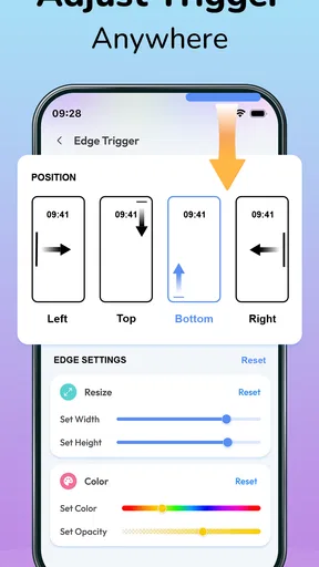
After installing the app, follow its setup instructions to enable the panel and choose how to bring it up, such as swiping from a screen edge or using another configured gesture. Available settings can vary by app version and Android device. Check the customization options before relying on a particular gesture, and adjust its position or appearance if it conflicts with notifications or your phone’s existing navigation controls.
Does iOS Control Center - Panel require special permissions?
Some functions may require permissions or Android accessibility features so the panel can appear over other apps or respond to gestures. The exact permissions depend on the features offered in your installed version. Review each permission request and the app’s privacy information before granting access, especially if a request seems unrelated to the controls you want. You can usually manage or revoke permissions later in Android settings.
Will it work on every Android phone, and can it affect performance?
Compatibility depends on your Android version, device manufacturer, and the app’s current requirements. A control panel overlay may behave differently when a phone uses custom gestures, battery restrictions, or another utility with similar functions. On some devices, keeping an overlay available may use additional resources or be stopped by battery optimization. Check the store listing for supported requirements and test the app on your device before depending on it.
Is iOS Control Center - Panel an official Apple app, and is it free?
No—an Android app styled after iOS controls should not be assumed to be made, endorsed, or supported by Apple. Pricing and monetization can change, and an app may include ads or optional in-app purchases even when its initial download is free. Before installing, check the current Google Play listing for the developer, price, purchases, recent updates, and user reviews so you know what to expect.


